
I began to
look at light differently
For a long time, light was something I mainly
thought about while painting. Daylight entering the studio, colours changing during the day. But over the past few years, as I started exhibiting my work more often, I began to look at light differently. Not only at the light itself, but at what happens when a painting leaves my studio.Where does it hang? What surrounds it? How much light reaches the surface? And what happens when part of it disappears into the dark?
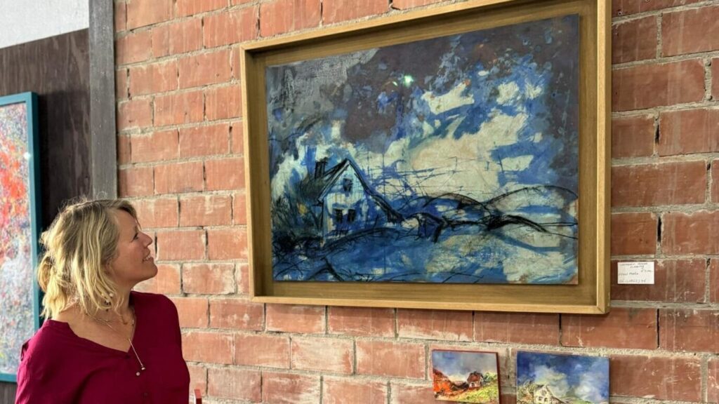
Kunstschouw Zeeland
I have become quite particular about this. I have even turned down an exhibition space
because the possibilities for lighting were simply too limited. A few years ago I probably would have thought: we’ll make it work somehow. Now I know that light can change the experience of a painting too much to ignore.
MOVING LIGHTS AROUND
AT KUNSTSCHOUW
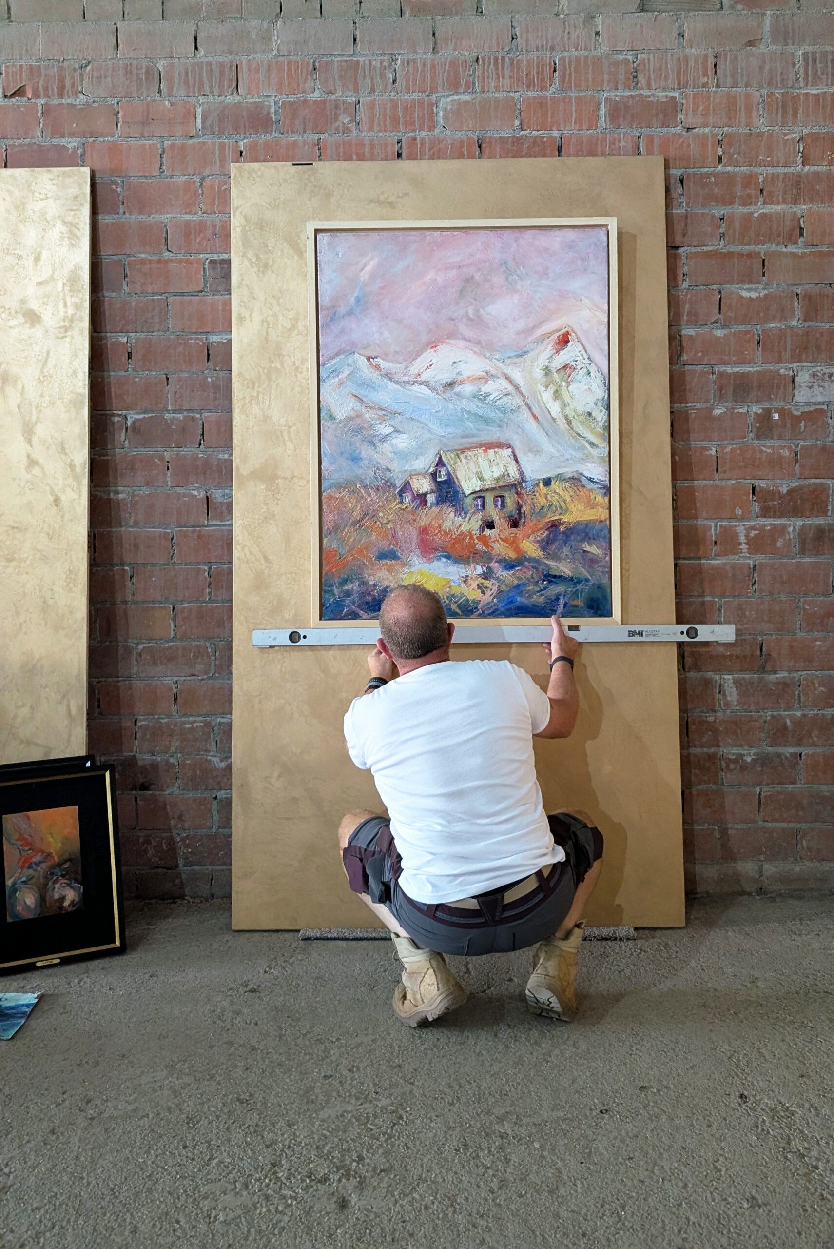
During Kunstschouw in Zeeland, we exhibited in a large old barn. A wonderful place, but certainly not a white cube with perfectly positioned museum lighting. So at some point we were all moving lights around. A little to the left. Higher. Lower. Stepping backwards, looking, moving them again.
Very practical, but also fascinating. Because every time the direction of the light changed, something happened to the paintings. Colours became stronger or disappeared. Texture became more visible. A dark area could suddenly open up, while another part of the painting became quieter.
The painting itself had not changed at all. The experience of it had. And once you start noticing that, it becomes difficult not to see it.
When not seeing everything makes you look longer
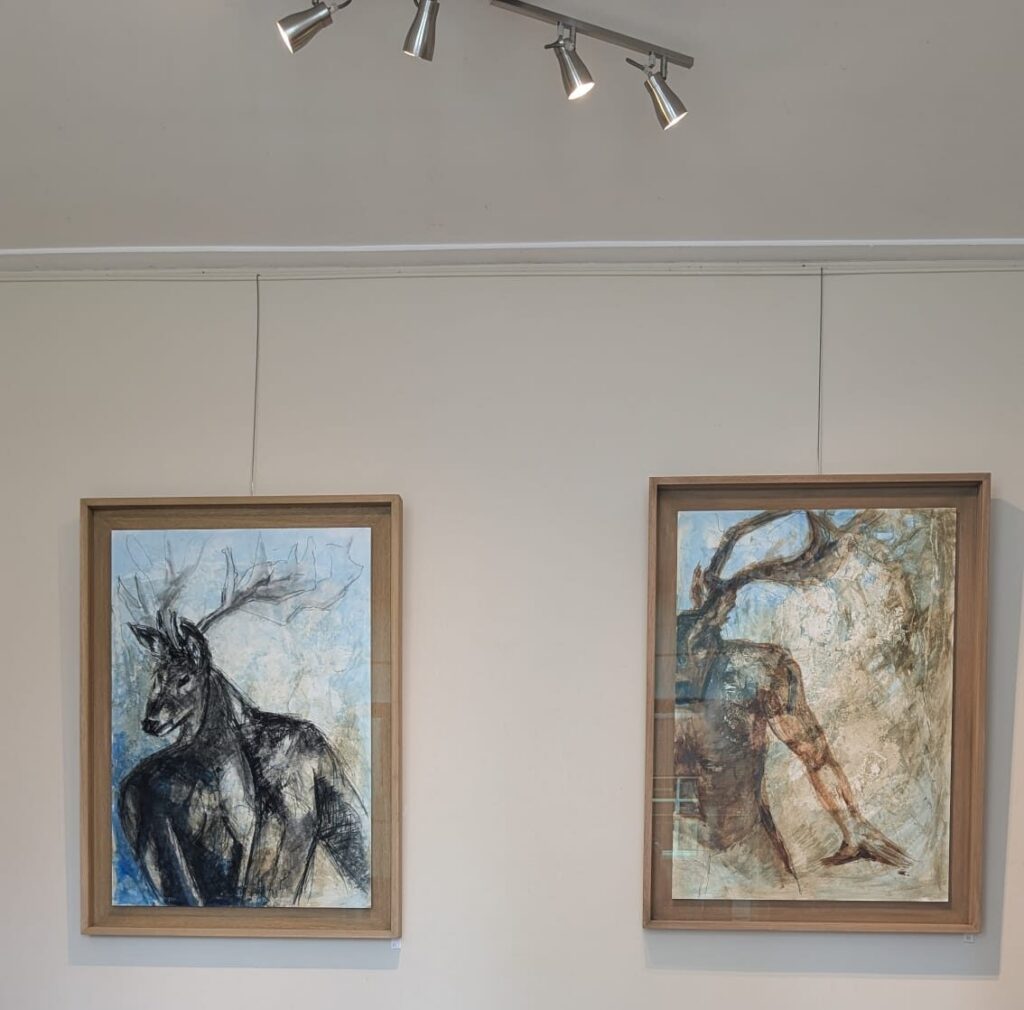
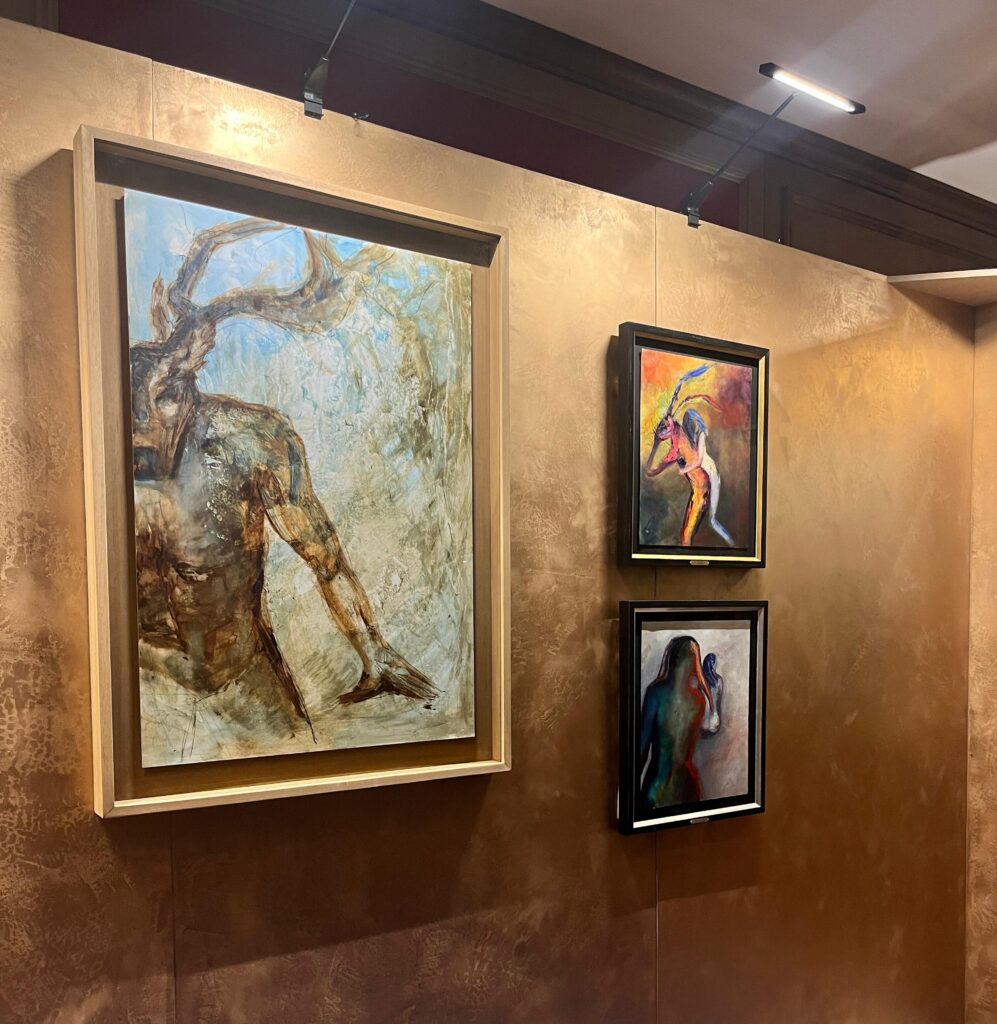
I noticed this even more strongly during an exhibition at Galerie De Pomp. One of my paintings was hanging in a place where the light did not reveal everything at once. Parts of the work became darker and less distinct. And I loved it.
The painting acquired a completely different presence. There was something mysterious about it because you couldn’t immediately see everything that was happening. People stopped in front of it, looked, and then began telling their own stories about what they thought they saw. That interested me enormously.
Because if you take that same painting into daylight, it changes again. Suddenly there are more colours, more marks and more details. Things that almost disappeared in the gallery become clearly visible. It is still exactly the same painting. And somehow it isn’t.
A tiny spotlight in a dark museum
I was reminded of this recently when I visited Meesterlijk Mysterie – Over Rembrandts raadselachtige tijdgenoot at Museum De Lakenhal in Leiden. The exhibition centred around the mysterious seventeenth-century painter known as Master I.S., whose identity and even gender remain unknown. Sixteen paintings were shown alongside early works by Leiden masters including Rembrandt van Rijn, Jan Lievens and Gerrit Dou.
It gave the paintings an almost secretive quality. You had to move closer. Your eyes needed a moment. Instead of receiving the whole image immediately, you had to search. I found that beautiful.
But something else caught my attention too: the light. Some of the paintings hung in considerable darkness, illuminated by a very small, precisely directed spotlight. Not the whole painting, just part of it. The rest seemed to disappear into the surrounding darkness.
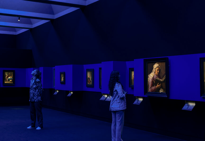
It also made me realise that good lighting does not necessarily mean making everything as clearly visible as possible. Sometimes what disappears is just as important as what becomes visible.
The room enters the painting
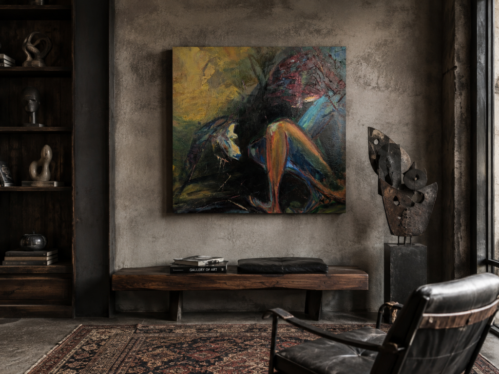
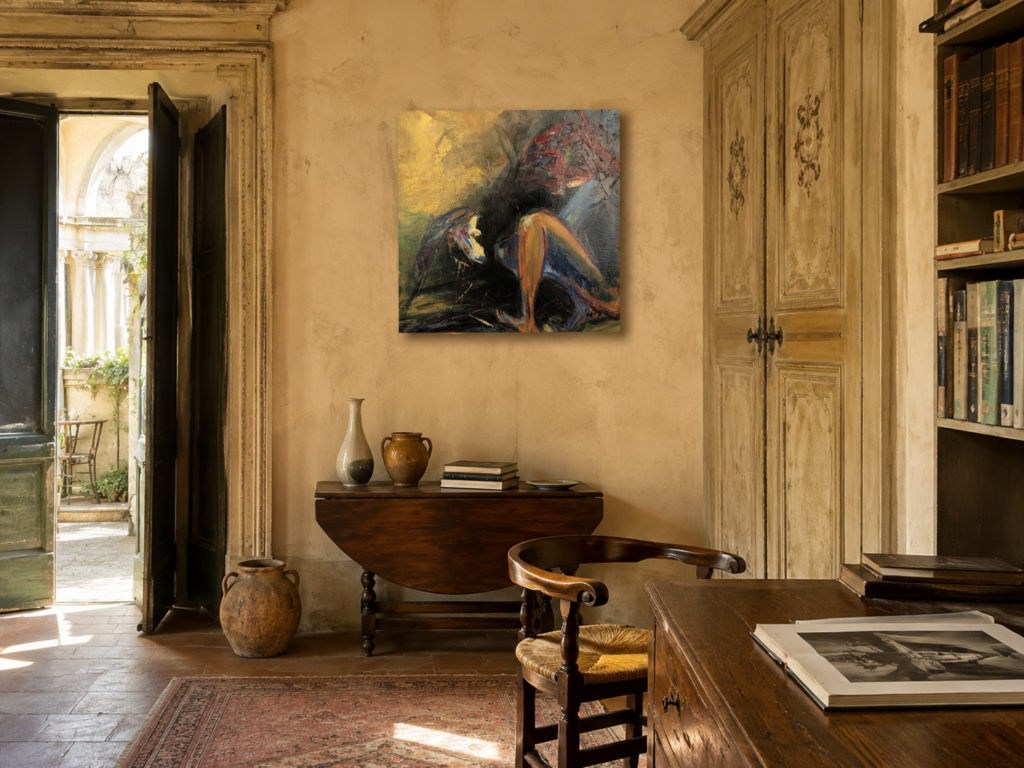
Once I became aware of this, I started looking differently at photographs and visualisations of my own work in interiors. Take Promise of Spring. Place the painting against a light wall in a room filled with daylight and certain colours begin to breathe. The work feels open and light.
Put exactly the same painting against a darker wall, or let the light come predominantly from one direction, and other parts come forward. The darker areas gain weight, edges become stronger and colours behave differently. Sometimes a wall colour even pulls out a colour in the painting that I had barely noticed before.
That is why I no longer really believe that a wall simply forms the background to a painting. The room participates. Light participates. Even the time of day participates.
I don’t think art needs to match the sofa
I have never been very interested in the idea that a painting should perfectly match an interior. Of course, colour and scale matter. You see immediately when something works beautifully in a room. But for me there is a difference between a painting having a relationship with its surroundings and a painting being chosen to complete a colour scheme.
I prefer a little tension. A painting may interrupt a room. It can introduce a colour that appears nowhere else. It can be rougher than its surroundings, quieter, stranger or more intense. Sometimes that difference is precisely what makes both the room and the artwork more interesting.
And then light starts playing with that relationship as well. Morning light can make a painting feel completely different from artificial light in the evening. A textured surface can remain almost quiet in diffuse daylight and suddenly become very physical when light hits it from the side. You don’t necessarily notice all of this when you first hang a painting. You start discovering it by living with it.
Seeing a painting outside the screen
Photographs are useful, but they cannot completely reproduce what light does to the surface of an original work. In my studio in Voorhout, you can see the paintings in daylight, move closer, step back and discover details that are difficult to capture in a photograph.
Studio visits are by appointment.